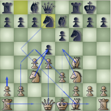
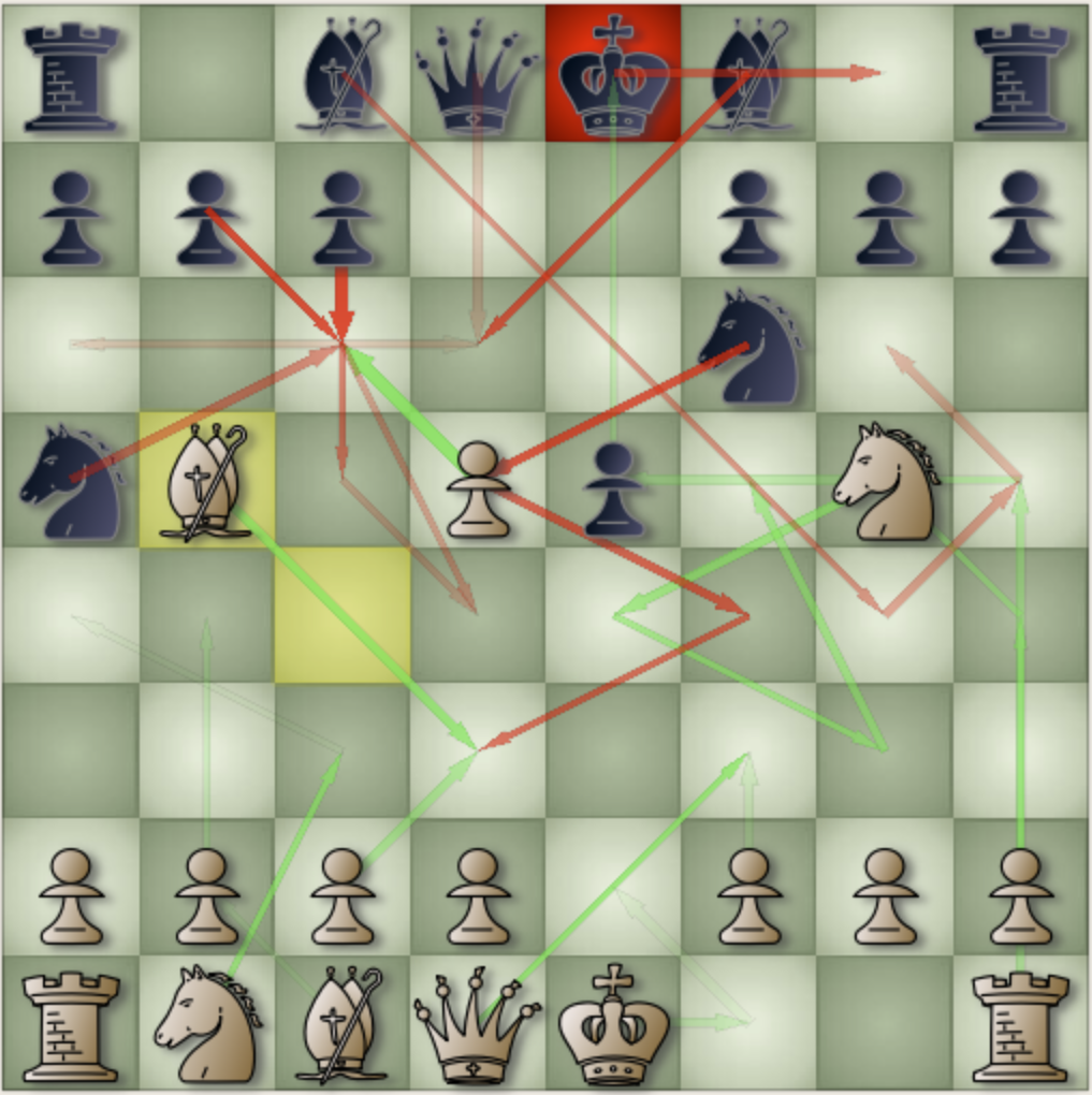
Thinking arrows are a good visual way to help users to sneak out what the engine is thinking. Typically a chess GUI shows one arrow for each engine when it has been thinking. The arrow is actually the first move of the latest PV line printed by that engine. In almost all cases, it will be the best move the engine will make for the current position.
Some people are curious about other moves in the PV line, wonder how they look and how useful we can get from them.
BSG can help us to experiment multi thinking arrows. Instead of only turning on/off to show one thinking arrow (for each engine), now users can set a number to display multi arrows. If the value is zero, it’s similar to turn off all arrows. If it is 1, that equals to turn on and show one arrow as it is in previous versions. If it is more than 1, BSG will display multi arrows based on moves in the PV lines as the traditional way. A large number (e.g., 100) means to display all moves in the PV. Users can also choose to display arrows for the side of the engine or both sides (set “all sides” to on).
The first arrow is displayed with the normal size and color (as before). The rest are displayed thinner and more transparent/dimmer thus users can distinguish them. Users may need to change/adjust the colors of arrows (they are the colors assigned to the engines) for a better view of those arrows.
On one hand, multi arrows may be useful: just by a glance users can get quickly some information such as which pieces, areas, moves have been involving, which pieces may be captured, if there are any threats/closed attacks to the Kings… From our observation, when the number of arrows is small, say, 1 or 2, it is not hard to track them.
However, on the other hand, when the number becomes bigger, there may be too many arrows on the screen, make it look so complicated, complex and it is not easy to follow them. Users should not set the value too high and/or needed some practice to “read” them.

